|


Creating a Color Matrix Plot
Overview
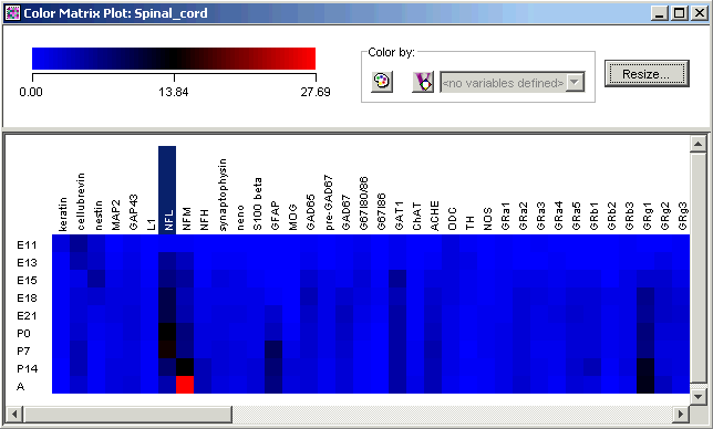
A color matrix plot is used to visualize the values in a dataset. The plot consists of a legend at the top and a grid of colored cells, with the genes in the columns and the samples in the rows. The legend consists of a color gradient above an expression value scale. The default range for the scale is from the minimum to the maximum value contained within the dataset.
Missing values are colored using the color value at the mid-point of the scale and have a white 'X' drawn through the colored tile (this is only visible if the dimensions of the colored tiles are large enough to display it).
Note: you cannot create a color matrix plot for an experiment (clustered dataset). For those, create a Matrix Tree Plot.
Actions
1. Double-click a dataset (raw, preprocessed, discretized, etc.) in the Experiments navigator. The item is highlighted and a color matrix plot of the dataset is displayed.
OR
1. Click a dataset in the Experiments navigator. The dataset is highlighted.
2. Click the Color
Matrix Plot toolbar icon ![]() , or select Color
Matrix Plot from the Explore menu,
or right-click the item and select Color
Matrix Plot from the shortcut menu. A color matrix plot of the
dataset is displayed.
, or select Color
Matrix Plot from the Explore menu,
or right-click the item and select Color
Matrix Plot from the shortcut menu. A color matrix plot of the
dataset is displayed.
Plot Indicators
As you move the mouse pointer over a gene or sample name, a gray bounding box is drawn around its column or row so you can easily see which tiles belong to it.
The names of one or more selected genes or samples are highlighted in dark blue with white text. It is not possible to select genes and samples concurrently.
Interacting With the Plot
Displaying a Gene Expression Value
Plot Functions
Color by Gene Lists or Variables
Customizing the Plot
Changing the Gradient Color and Scale
Resizing Cells in a Color Grid
Toggling the Color Grid On or Off
Related Topic:
Displaying a Summary Statistics Chart