|


Changing the Gradient Color and Scale
Overview
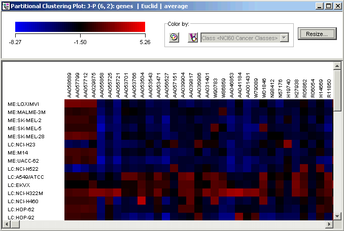
At the top of the color matrix, matrix tree and two way matrix tree plots is a legend. The legend consists of a color gradient and a corresponding expression level scale. The scale shows the minimum, middle and maximum expression values mapped on the plot.
Each colored tile on the plot represents the expression level of that gene (column name) for that sample (row name). The color of a tile is determined by the color gradient at that expression level.
Actions
Changing the Scale of the Gradient
1. Right-click on the plot and select Customize from the shortcut menu. The Customize dialog is displayed.
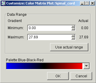
Type a new value into the Minimum and/or the Maximum field and press <Enter> or use the scroll arrows to set the value(s).
Click the Use actual range button to set the minimum and maximum for the display from the actual minimum and maximum values in the dataset.
As the new values are entered or set, the plot is re-drawn using the new values giving you a chance to preview your changes.
4. Click OK to keep the new values, or click Cancel to revert to the previous ones.
Changing the Color of the Gradient
1. Right-click on the plot, and select Customize from the shortcut menu. The Customize dialog is displayed.
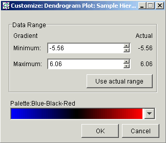
2. Click a new color scheme from the Palette drop-down list. The plot is re-drawn using the new values giving you a chance to preview your changes.
3. Click OK to keep the new color scheme, or click Cancel to revert to the previous color scheme.
Note that the color scheme is universal. All matrix tree, color matrix and two way matrix tree plots displayed will use the selected color scheme.
Related Topics:
Resizing Cells in a Color Grid