|

Creating a Summary Statistics Chart
Overview
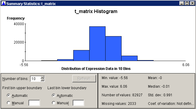
The Summary Statistics chart is a combination of a histogram plot of the values in a dataset (user selectable parameters) and a textual display of several key statistical values describing the dataset. This information could be used to see how many of the dataset’s values fall outside an expected range (possibly due to experimental error or other sources of ‘noise’). Another use could be to estimate whether the data values conform to an approximately normal or other sort of distribution. Since microarray data are almost never normal, this may be more useful after, for instance, log-transformation.
The numeric statistics given in the lower half of the display could be used to summarize and compare different datasets. For instance, the coefficient of variation is a one-number summary of how the data's variation compares to its magnitude.
Histogram Chart
The histogram shows the distribution of the data values among a number of bins (15 is the default). A bin is a container for data values. Each bin has a minimum and a maximum bound. All data points that are greater than (and in the first bin equal to) the minimum bound and less than or equal to the maximum bound of a certain bin are placed into this bin.
The chart’s x-axis is labeled with the minimum bound for the first bin and the maximum bound for the last bin. If the minimum cutoff value is changed, the first bin is given a lower bound of -infinity. If the maximum cutoff value is changed, the last bin is given an upper bound of +infinity.
The chart’s y-axis is labeled with the frequency of data values. The sum of the frequencies from all the bins equals the number of data values in the selected table, gene(s) or sample(s) (excluding missing values).
Statistics Textual Display Items
minimum value
maximum value
mean
median
number of values (excluding missing ones)
number of missing values
standard deviation
co-efficient of variance.
Chart Parameters
The chart parameters area is the place to specify the number of bins. Changing the number of bins causes the data range (minimum to maximum bound) for each bin to change. To have a smaller range per bin, increase the number of bins. Conversely, to have a larger range per bin, decrease the number of bins. Note that only integer values are accepted.
The chart parameters area is also the place to change the cutoff values. The minimum and maximum cutoff values are the upper bound of the first bin and the lower bound of the last bin respectively. When the Manual radio button is first clicked, the present cutoff value is displayed in the appropriate text box. To change the cutoff value, type over the displayed value.
The minimum and maximum cutoff values can be used to separate outliers from the main data by placing the outliers in bins outside the main data grouping. This is done by setting the minimum and maximum cutoff values at or near the outer bounds of the main grouping. For example, if the minimum cutoff value is set to .5 and the maximum cutoff value is set to 7.5, then all values less than or equal to .5 are grouped into one outlier bin that appears to the left of the ‘.5’ data co-ordinate label on the x-axis and all values greater than 7.5 are grouped into one outlier bin that appears to the right of the ‘7.5’ data co-ordinate label on the x-axis. All bins other than outlier bins maintain a contiguous linearity with respect to the x axis.
Actions
1. Click a complete or incomplete dataset in the Experiments navigator, or select gene(s) or sample(s) from a plot. The item is highlighted.
2. Click the Summary
Statistics toolbar icon ![]() , or select Summary
Statistics from the Statistics
menu, or right-click the item and select Summary
Statistics from the shortcut menu. The Summary Statistics chart
is displayed.
, or select Summary
Statistics from the Statistics
menu, or right-click the item and select Summary
Statistics from the shortcut menu. The Summary Statistics chart
is displayed.
Changing the Number of Bins
1.Parameters area. The minimum number of bins is 1 (without outlier bins), 2 (with 1 outlier) or 3 (with 2 outliers). The maximum number of bins is 1000. If you enter a value that is out of range, the Refresh button is disabled (grayed out).
2. Click the Refresh button to display the chart using the new parameters.
To change the default number of bins, see Changing Your User Preferences.
Changing the Cutoff Values
1. Click the Manual radio button and/or type the value into the First bin upper boundary and/or Last bin lower boundary text box. You do not have to change both.
2. Click the Refresh button to display the chart using the new parameters.
Note: the Refresh button is disabled (grayed out) when the values (# of bins and cutoff values) match the current chart characteristics.
Exporting the Image
1. Click the histogram to make it the active window.
2. Select Export Image from the File menu, or right-click on the chart and select Export Image from the shortcut menu. The Save As dialog is displayed.
3. Navigate to the destination folder and fill in the name for the image file or accept the default name. The export image file includes the title, histogram, and summary statistics text. (For a complete dataset, the title could be the experiment name. For a single gene or sample, the gene or sample name could be used.)
Note: When a report on a complete or an incomplete dataset is generated, the textual representation of the summary statistics is included within it.
Related Topics: