|


Creating a Scatter Plot
Overview
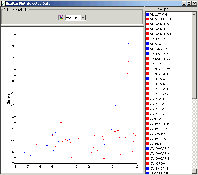
The scatter plot can be used for the pair-wise comparison of either two samples or two genes. This plot can be launched from the table viewer, color matrix, or matrix tree plot by selecting either two samples or two genes.
In the case of samples, this plot can be used to visually determine those genes that show significant induction or repression between the two selected samples since differentially expressed genes will lie either above or below the line of slope=1.
Similarly, if two genes are selected, the plot will visually display the relative proportion of the two selected genes across all samples. This plot could be used in the case where a great deal of information exists about two genes - for example in the case of co-regulated genes. In this case you might expect the genes to maintain a constant proportion across all samples. Such a plot could be used to visually inspect this hypothesis.
Actions
1. Display a table view or color matrix plot of a dataset, or a matrix tree plot of a clustering experiment.
2. Select two rows (to plot sample vs. sample) or two columns (to plot gene vs. gene) in the table by clicking on the row/column names while holding down the <Ctrl> key.
3. Select Scatter Plot from the Explore menu. A scatter plot of the two rows/columns is displayed.
Interacting With the Plot
Displaying an Expression Value
Plot Functions
Color by Gene Lists or Variables
Customizing the Plot
Related Topics:
Creating a Table View of Gene Expression Data