|

Creating a Scree Plot
Overview
A Scree Plot is a simple line segment plot that shows the fraction of total variance in the data as explained or represented by each PC. The PCs are ordered, and by definition are therefore assigned a number label, by decreasing order of contribution to total variance. The PC with the largest fraction contribution is labeled with the label name from the preferences file. Such a plot when read left-to-right across the abscissa can often show a clear separation in fraction of total variance where the 'most important' components cease and the 'least important' components begin. The point of separation is often called the 'elbow'. (In the PCA literature, the plot is called a 'Scree' Plot because it often looks like a 'scree' slope, where rocks have fallen down and accumulated on the side of a mountain.)
Note: the maximum number of Principal Components to display is set in Preferences under the Edit menu. This only applies to what is displayed in the Scree Plot and the Loadings Line Plot. This setting does not affect the actual calculation of the PCs. It solely sets an upper limit on the number of PC's to display in these two plots; therefore it does NOT have to be set before the PCs are calculated.
GeneLinker™ also limits the number of PCs by their contribution towards representing fractions of the total variance of the date (i.e., their numerical relevance). Only PCs associated with respective eigenvalues greater than or equal to 1E-8 are included in the calculation result set. But in practice, PCs with respective eigenvalues (i.e., fractions of data total variance) less than about 0.1, are rarely of much interpretive use or value.
Note also that a PC's pointing direction (e.g., southeast rather than northwest) along the line co-linear with the PC is irrelevant. Therefore, reversing the algebraic signs of all the constituent values of a PC in, for example, a Loadings Line Plot, is irrelevant.
Actions
1. Click a PCA Experiment in the Experiments navigator. The item is highlighted.
2. Select Scree Plot from the PCA menu, or right-click the item and select Scree Plot from the shortcut menu. The Scree Plot is displayed:
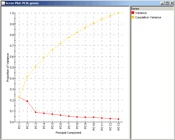
The x axis contains the Principal Components sorted by decreasing fraction of total variance explained. (The numerical labels assigned to each PC are according to this ordering, and persist whether or not the Scree Plot is actually displayed.) The y axis contains the fraction of total variance explained. Along the red line, numerical values of each PC can be seen in a tool tip. Note the 'elbow' in the red line at PC3 in this example; hence, PC1 and PC2 are the most important. PC3 through PC7 are interpreted then as unimportant. Sometimes the PC at the 'elbow' can be considered important too if its fraction of the total is substantial (it is not in this example).
The cumulative fraction of total variance explained is also shown in yellow-orange. Numerical values can be seen in a tooltip.
Interpretation:
The Scree Plot has two lines: the lower line shows the proportion of variance for each principal component, while the upper line shows the cumulative variance explained by the first N components. The principal components are sorted in decreasing order of variance, so the most important principal component is always listed first.
Using the Plot
Displaying an Expression Value
Customizing the Plot
Plot Functions
Related Topics:
Overview of Principal Component Analysis (PCA) Functionality
Tutorial 5: Principal Component Analysis (PCA)