|


Creating a Score Plot
Overview
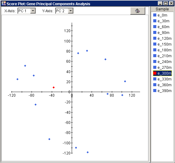
The Score Plot involves the projection of the data onto the PCs in two dimensions. The PCs were computed to provide a new space of uncorrelated 'variables' which best carry the variation in the original data and in which to more succinctly represent the original 'samples'. The typical application of PCA is to find the PCs of the Genes ('variables'), and then project the Samples ('samples') onto those PCs. Since typically there are many fewer PCs than genes, it is often easier to see structure in your data with this projection-based plot than it would be in the original data.
The Score Plot is a scatter plot. The x axis contains a user-selected PC. The y axis contains another user-selected PC. The plot contains points that represent the original 'samples' (e.g., projected Samples if PCA by Genes (the 'variables'), projected Genes if PCA by Samples (the 'variables')) projected onto the user-selected PCs. By default, the Score Plot shows data on the first two PCs.
Actions
1. Click a PCA Experiment in the Experiments navigator. The item is highlighted.
2. Select Score Plot from the PCA menu, or right-click the item and select Score Plot from the shortcut menu. The Score Plot is displayed.
Normalizing the Data
The Raw
Data/Normalize button ![]() in the upper right corner
of the plot acts as a switch between two views of the data: raw and normalized.
The button 'pressed' state displays the normalized view, the 'unpressed'
state shows the raw view. The normalized view is shown below:
in the upper right corner
of the plot acts as a switch between two views of the data: raw and normalized.
The button 'pressed' state displays the normalized view, the 'unpressed'
state shows the raw view. The normalized view is shown below:
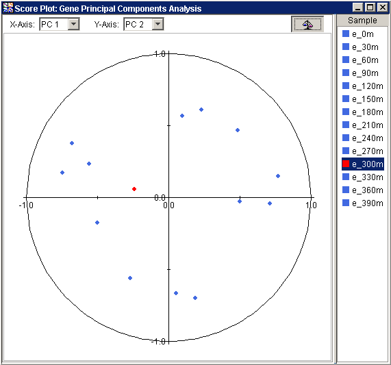
The normalized view is strictly analogous to, and presents the same information as, the raw view. The essential difference is that in the normalized view, before the points are plotted, the projected values are divided by the Euclidean norm, i.e., vector length, of the respective row of Samples (if PCA by Genes) or respective column of Genes (if PCA by Samples).
In some cases, the PCs can be interpreted biologically. This normalized view allows you to easily identify the genes or samples that share the properties of the PCs selected for axes of the plot.
Values close to 1 (one) for any normalized view indicate that the sample or gene is almost parallel to the principal component; -1 implies anti-parallel. This view provides a relative measure of how closely correlated each Sample (if PCA by Genes) or Gene (if PCA by Samples) is to an axis PC.
Note: Plotting a PC against itself may correctly result in points falling outside the unit circle. This is the only case that will do so. Plotting a PC against itself provides no useful information.
Note: The term ‘normalized’ here refers to the re-scaling of projections for the 3D Score Plot. It does not refer to any normalizations of the raw data that may, or may not, have been done prior to performing the PCA.
Changing the PCs
To change the PC represented by the x-axis, click on a PC in the x-axis drop-down list in the upper left corner of the plot. The plot is updated using the new x-axis PC.
To change the PC represented by the y-axis, click on a PC in the y-axis drop-down list in the upper center of the plot. The plot is updated using the new y-axis PC.
Using the Plot
Displaying an Expression Value
Customizing the Plot
Plot Functions
Related Topics:
Overview of Principal Component Analysis (PCA) Functionality
Tutorial 5: Principal Component Analysis (PCA)