|


Tutorial 5: Step 6 Display a Score Plot
Visualize the Projection of the Samples
In Alter et al. it was clear that there were cyclic patterns in the data, visible across different genes. The next question was whether this cyclic behavior could be seen in the time progression of the samples. One way to study this is to look at the score plot of the Principal Component Analysis. In particular, since the first two principal components of the genes seem to show this cyclic property, and they account for the majority of the variance in the data, we would like to examine the projection of the samples over time onto these two most important components.
Display a Score Plot
1. If the PCA:genes experiment in the Experiments navigator is not already highlighted, click it.
2. Select Score Plot from the PCA menu, or right-click the item and select Score Plot from the shortcut menu. A score plot of the PCA results is displayed.
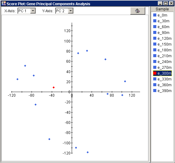
The scatter plot displays a point for every sample in the dataset and it can be difficult to interpret , especially with respect to the units. However, if you look carefully at the points and their distribution you will see that there is a pattern to the data.
3. On the right hand side of the Score Plot in the legend, click the first data point, e_0m. The name is highlighted as is its point in the bottom of the plot.
4. Press the <down arrow> to select successive samples (e_30m, e_60m, etc) and watch as the highlighted point walks clockwise around the plot.
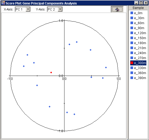
This general clockwise layout of the points as they lie in time is another indicator that a cyclic behavior is being captured by the first two principal components. To better see this pattern, normalize the Score Plot:
5. Click the Raw
Data/Normalize Score Plot button ![]() in the upper
right of the score plot window. The score plot is updated to show a normalized
version of the data.
in the upper
right of the score plot window. The score plot is updated to show a normalized
version of the data.
Interpretation
In this plot, the original samples are again projected onto the new variables or principal components. The difference is that the projections have been normalized so the values in the plot reflect how similar each sample is to a given principal component. Alter referred to this as the correlation between a sample and a principal component. Using this type of plot we can make more direct comparisons of the amount each principal component represents of each sample. Again, we can see the points that fall successively in time also follow each other in a clockwise direction around the unit circle.
In both the raw and normalized versions of the score plot, the 300 minute sample (e_300m) seems to break the circular pattern. In such cases, where one or two point seem to be anomalous, or break a general pattern in the data, it can be helpful to study these exceptional points using other sources of information. For example, with PCA, we do not need to limit ourselves to the first two principal components.