|


Tutorial 5: Step 7 Display a 3D Score Plot
Display a 3D Score Plot
1. Double-click the PCA:genes experiment in the Experiments navigator. The item is highlighted and a 3D score plot of the selected item is displayed showing the first three PCs.
OR
1. If the PCA:genes experiment in the Experiments navigator is not already highlighted, click it.
2. Click the 3D
Score Plot toolbar icon ![]() , or select 3D
Score Plot from the PCA
menu or right-click the item and select 3D
Score Plot from the shortcut menu. A 3D score plot of the selected
item is displayed showing the first three PCs.
, or select 3D
Score Plot from the PCA
menu or right-click the item and select 3D
Score Plot from the shortcut menu. A 3D score plot of the selected
item is displayed showing the first three PCs.
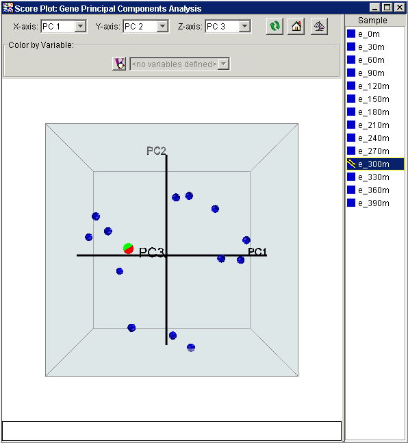
Notice that this view is similar to the 2-dimensional plots from before, but with the depth of the points reflecting their scoring relative to the third principal component.
3. In the right-hand list of points (legend), click the point 'e_300m'. The item and its point are highlighted.
Rotate the plot
1. Click on the plot and slowly drag the mouse to the left to spin the plot until it is similar to the one below.

Interpretation
This plot brings out a dramatic difference between the measurements at 300 minutes relative to the other measurements. Not only do the gene expression levels at this time seem not share the same cell cycle patterns as the other time points, this time point has very different properties, reflected in the abnormally high score in the third principal component. This indicates that something fundamentally different occurred during this measurement, with either experimental error or some type of significant biological change being the natural candidates.
2. Click the Home
button ![]() in the upper right of the plot. This returns the
plot to its original orientation.
in the upper right of the plot. This returns the
plot to its original orientation.
3. Click the Raw
Data/Normalize 3D Score Plot button ![]() in the upper
right of the score plot window. The 3D score plot is updated to show a
normalized version of the data. Rotate the plot as above.
in the upper
right of the score plot window. The 3D score plot is updated to show a
normalized version of the data. Rotate the plot as above.
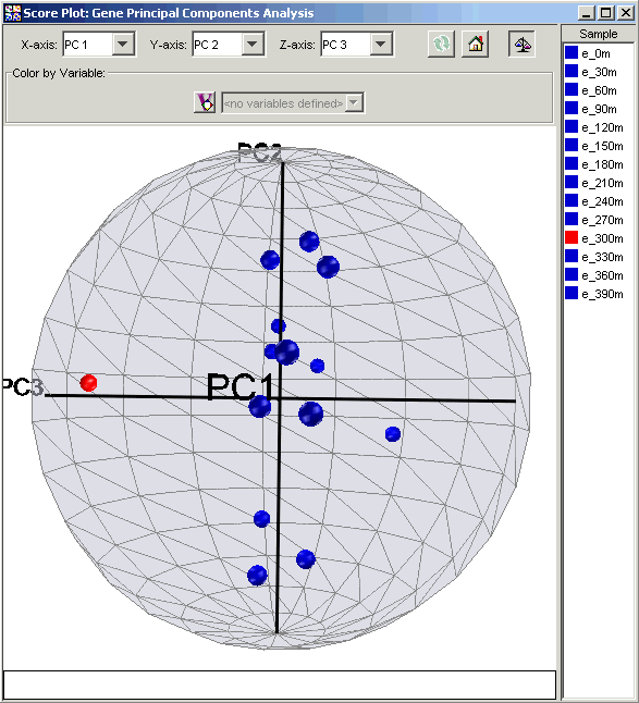
Interpretation
In a score plot, the later principal components, which represent less of the overall variance, can seem visually less significant than the first few principal components. This appearance can be deceptive and lead you to neglect the real impact or separation due to later principal components. To compensate, score plots may be normalized so that each principal component has the same range (-1 to +1). When normalization is applied to the Elutriation data, the separation of time point e_300m along PC3 is even more visible than in the original plot.