|


Tutorial 5: Step 4 Display a Loadings Line Plot
Visualize the Principal Components
The principal components are new variables made up of combinations of the original data variables, in this case, genes. Each component is some linear combination of the original gene variables, and often looking at which genes or gene families have a large contribution to a principal component can be an indication of shared function of behavior, similar to the inferences that can be made using clustering.
Three plots are available to view the coefficients or loadings: Loadings Scatter Plots, Loadings Line Plots and Loadings Color Matrix Plots. Loadings Scatter Plots with many thousands of variables tend to be non-informative: they are better suited to PCA on smaller gene sets or on samples. As a results, we will focus our attention on the other two plot styles.
Display a Loadings Line Plot
1. If the PCA: genes experiment in the Experiments navigator is not already highlighted, click it.
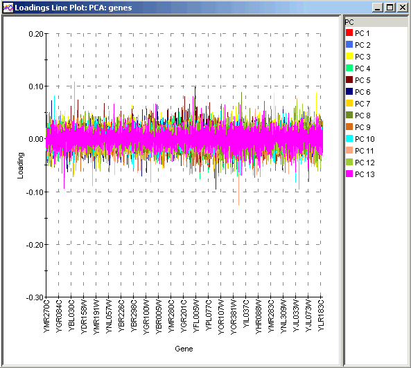
2. Select Loadings Line Plot from the PCA menu, or right-click the item and select Loadings Line Plot from the shortcut menu. A loadings line plot of the PCA results is displayed.
If you want the plot to be wider, right-click on the plot and select Resize from the shortcut menu to set the desired dimensions of the plot.
Interpretation
Even in this traditional Loadings Line Plot it is difficult to see much structure. In particular, the first two principal components, which are of most interest because of their ability to explain most of the variance in the data, are quite difficult to see in this plot. A Loadings Line Plot can be more helpful when PCA is done by samples or if a relatively small number of genes is being studied.