|


Tutorial 5: Step 3 Display a Scree Plot
Principal components can be used to determine how many real dimensions there are in the data. There is a particular mathematical meaning to number of dimensions, but an intuitive understanding can be achieved by considering the amount of variation in the data that is explained by various principal components. If a small number of components accounts for most of the variation in the data, then the other components can be thought of as noise variables.
Determining which principal components account for which parts of the variance can be done by looking at a Scree Plot.
Display a Scree Plot
1. If the PCA: genes experiment in the Experiments navigator is not already highlighted, click it.
2. Select Scree Plot from the PCA menu, or right-click the item and select Scree Plot from the shortcut menu. A scree plot of the PCA results is displayed.
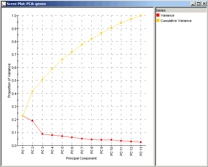
Interpretation:
The Scree Plot has two lines: the lower line shows the proportion of variance for each principal component, while the upper line shows the cumulative variance explained by the first N components. The principal components are sorted in decreasing order of variance, so the most 'important' principal component is always listed first. In this dataset the first two principal components explain much more of the variance in the data (roughly 25% and 20% respectively) than do any of the subsequent principal components (all less than 10%). In this data, most of the important biological behavior is somehow being captured in these two components, leading us to take a closer look at them and their meaning in the context of the yeast cell cycle.