|


Tutorial 2: Step 4 Display Color Matrix Plots
In this step, we use the Shared Selection feature to see which gene was filtered out during missing value estimation.
1. Double-click the 3-nearest-neighbors estimation dataset in the Experiments navigator. The item is highlighted and a color matrix plot of the dataset is displayed.
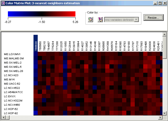
2. Click the first gene name on the plot. The gene name is highlighted.
3. Use the scrollbar on the bottom of the plot to scroll to the far right.
4. Press and hold down the <Shift> key and click the last gene name on the plot. All of the gene names are highlighted.
5. Double-click the t_matrix dataset in the Experiments navigator. The item is highlighted and a color matrix plot of it is displayed.
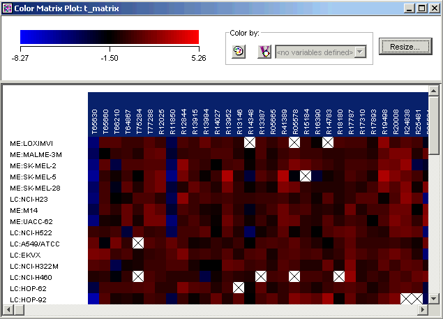
Notice that the genes that you selected on the first plot are highlighted in the new plot. This facility called shared selection helps you locate selected genes on any table or plot in which they appear.
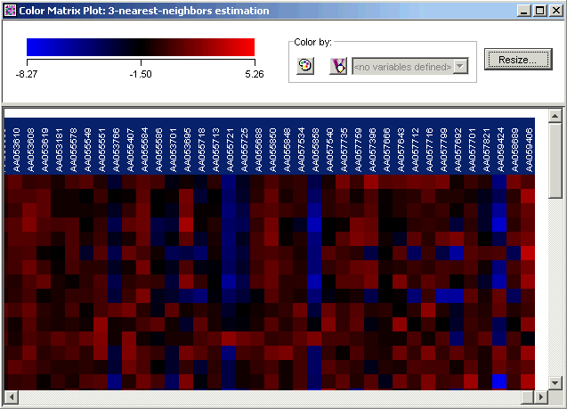
6. Scroll slowly to the right. You will see one gene that is not highlighted. This is the gene that was filtered out when you estimated missing values.
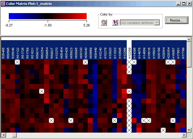
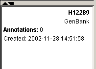
7. Click the non-highlighted gene (gene H12289). The gene is highlighted and the rest are un-highlighted. Look at the information about the gene in the Description Pane.
In the next step, we will import a gene list that contains additional information about the genes in the dataset.