|

Tutorial 1: Step 8 Create a Cluster Plot
There are several ways to examine cluster membership in detail. One is to create a Matrix Tree Plot as you did for the hierarchical clustering. In the case of partitional clustering, the 'tree' is flat, not hierarchical. Another way is to create a Cluster Plot from the clustering item in the Experiments navigator.
Create a Cluster Plot:
1. If the partitional clustering item in the Experiments navigator is not already highlighted, click it.
2. Select Cluster Plot from the Clustering menu, or right-click the item and select Cluster Plot from the shortcut menu. A cluster plot of the dataset is displayed.
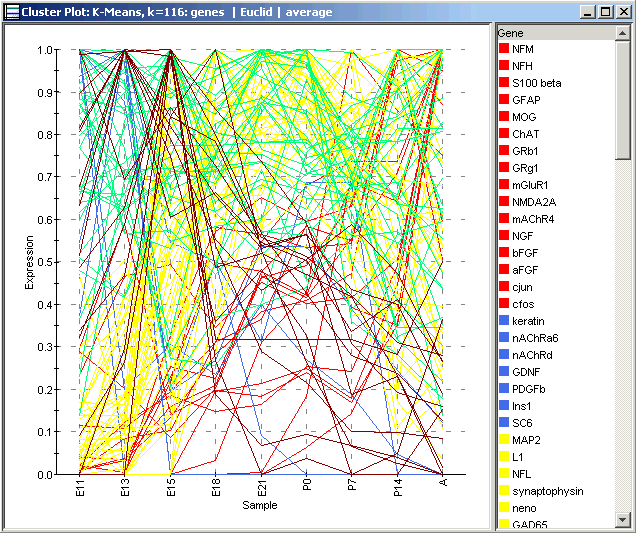
A Cluster Plot of the entire dataset shows a line for each gene (because genes, not samples, were clustered). Each line is colored according to the cluster it belongs to. As you can see, the plot is fairly busy and not terribly informative even for a moderate amount of data like this. It is more informative to plot the individual clusters.
To Plot an Individual Cluster:
1. Click on the Centroid plot to make it the active window.
2. Click on a cluster name in the legend to highlight it and its line in the Centroid Plot. You can also click on the line itself, but with other lines nearby this may be difficult. For the purposes of this tutorial, select only one cluster (cluster 1 for the image below).
To select multiple clusters, press and hold the <Ctrl> key and click on cluster names in the legend.
To select a series of clusters, press and hold the <Shift> key and click on the first and last cluster names in the series.
3. Select Cluster Plot from the Clustering menu, or right-click on the plot and select Cluster Plot from the shortcut menu. A cluster plot of the selected cluster is displayed.
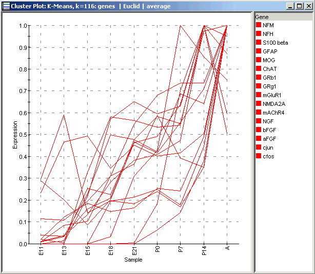
The new Cluster Plot shows the individual gene profiles for the genes in the selected cluster only, and also shows their names in the legend on the right. This illustration shows Cluster 1 from the Centroid Plot above. If you compare the genes present in the picture above with those in Wen’s Wave 4, you will see considerable but not perfect overlap.
See if there is a similar cluster in your clustering of the data. What genes does it have in common with the example shown here, and with Wen’s Wave 4?