|

Tutorial 1: Step 5 Create a Matrix Tree Plot
GeneLinker™ has an excellent set of plots for examining your data. These are described in detail in the Plots section of the online manual.
If the matrix tree plot is already displayed, there is no need to recreate it. Read the Interpretation section below for information about the plot.
Create a Matrix Tree Plot
1. Double-click the hierarchical clustering experiment just created in the Experiments navigator. The item is highlighted and a matrix tree plot of the selected item is displayed.
OR
1. If the hierarchical clustering experiment just created in the Experiments navigator is not already highlighted, click it.
2. Click the Matrix
Tree Plot toolbar icon ![]() , or select Matrix
Tree Plot from the Clustering
menu, or right-click the item and select Matrix
Tree Plot from the shortcut menu. A matrix tree plot of the selected
item is displayed.
, or select Matrix
Tree Plot from the Clustering
menu, or right-click the item and select Matrix
Tree Plot from the shortcut menu. A matrix tree plot of the selected
item is displayed.
A tree plot can take up a lot of space on your screen. You may want to maximize the GeneLinker™ window if it's not already maximized, and/or stretch the pane displaying the tree plot as wide as possible. Note that you can increase the width of the plots pane and reduce the width of the navigator pane by clicking-and-dragging the frame between them with the mouse.
Interpretation
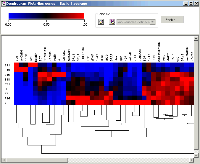
In the hierarchy just created, note that at the extreme left of the plot is a cluster of several genes that are highly expressed early in the embryonic stage, at days E11, E13 and E15. This cluster includes the established early developmental markers nAChRd, G67I86, G67I80/86, nestin and nAChRe, as well as SC6, PDGFb, Ins1, keratin, SC7 and trk (see Wen et al. for explanation of gene name abbreviations).
Another cluster of genes with slightly broader expression profiles, but still mostly embryonic, appears at the extreme right of the plot (use the scrollbars to view the right of the plot). This cluster includes nAChRa6, PDGFR, MK2, NT3, GDNF, TH, cellubrevin, cyclin B, Brm, Ka1, and is enriched in members of the insulin-like growth factor signaling pathway, IGFR1, IGF II, IGFR2, the latter being a receptor/ligand gene pair.
Between them, these clusters map well to Wen's 'Wave 1'. Note that the combined clusters contain another receptor/ligand pair, PDGFb and PDGFR.
Just to the left of the right-most group is a cluster of nearly constantly expressed genes, easily picked out by eye as a nearly-solid mass of red. This cluster includes 'housekeeping' genes such as actin, TCP, SOD, CCO1 and CCO2, and maps well to Wen's 'Constant' class.
Examine the tree plot for other groups with similarly simple characterizations, such as high expression in the adult mouse (Wen's Wave 4) or in the perinatal timepoints (Wen's Wave 3).
There are two reasons why the early-expressed genes don’t all appear side-by-side:
1. In the normalization and metric used above, the genes in the cluster including PDGFR, GDNF, and cellubrevin are mathematically closer to the constant genes than to the very early genes such as PDGFb, Ins1, and keratin. The mathematics don't always reflect qualitative ideas about similarity. However, if you try different normalizations and metrics you will obtain different clusterings. For example, if you try Scaling between 0 and 1 (instead of Divide by Maximum as you did above) you will find that the 'constant' cluster disappears, because this will magnify each gene's range of expression so that none will appear to be constant.
2. There is some arbitrariness in the construction of a tree diagram. At each branch point, GeneLinker™ must decide which branch to draw to the left and which branch to draw to the right. Consequently, the subcluster on the extreme right of our tree is no further mathematically from the subcluster on the extreme left than any other subcluster in the right half of the plot.