|


Platinum
Classifier Gradient Plot
Overview
A classifier gradient plot can be used to visualize the results of creating an IBIS classifier, an IBIS search operation, or classification of a dataset using an IBIS classifier.
Plot Description
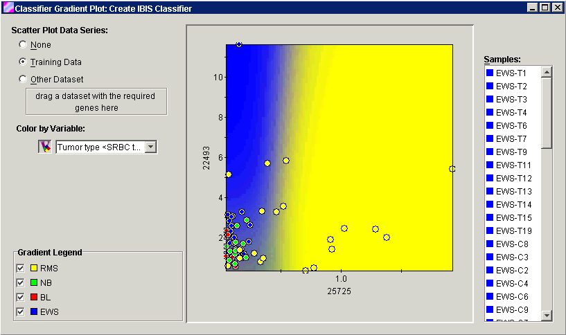
Data points: The points on the plot represent the gene expression values for the samples in the displayed dataset. By default, the points are colored by the training variable. They may be colored by any associated variable, not just the training variable, to show how well the classifier predicts the other variable. You may display the data points from a compatible dataset or no data points at all.
Background Gradient: The plot grid coordinates are run through the classifier to create a background gradient. The color of each pixel in the background represents the classifier's class prediction for that coordinate location. For example, if you represent class x with bright red, then any spot on the background that is red is in a region that the classifier would predict that a sample belongs in class x.
In cases where the classifier is not able to make a certain prediction. (For instance in regions where the predictions shift from class x to y), you may notice that the background blends from one color to the next. The actual color does not change with the strength of the classifier vote; its transparency does. At a point where the committee is 80% sure that the point is blue and 20% sure that the point is red, the final color will be a translucent blue which is 20% transparent and a red which is 80% transparent. (0% being opaque and 100% being invisible). In many cases, the IBIS classifiers are quite certain with their predictions, so a tight boundary usually exists between classes. If you de-select the dominant color, then the other colors become visible.
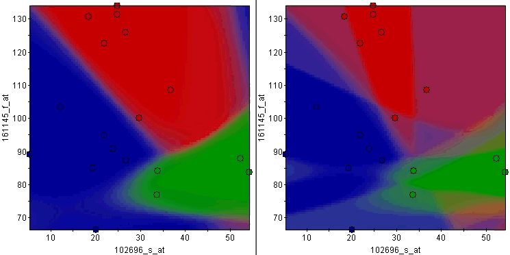
If you look at the bottom right corner of the left plot, you will notice the color is neither red, green, nor blue. If you uncheck all of the colors and enable them one at a time, you will see that the corner is a combination of red and blue, indicating that the committee of IBIS classifiers was unsure about the class in that region. Some of the committee members voted for red and others voted for blue. The relative intensity of the color tells you if one is more probable than the other.
The blending of colors is much more obvious in the rainbow plot on the right. This plot is of the same data, but the classifier used on it was created with a smaller committee size. With a smaller committee, the chances of it settling on a prediction at a boundary decreases, resulting in much larger shifts in the predictions. You can see regions where the classifier thought there was a chance of the prediction being red, blue and green all at the same time. So although this is a good example on how to interpret the coloring scheme, in general, this exemplifies the value of having a larger committee size (at least 10 or the number of samples in the dataset, whichever is smaller).
Plot Size: The X and Y axis ranges are determined by the gene expression values for the data that was used to create the classifier (the training dataset). If you drag a compatible dataset (a dataset that contains the classifier gene or gene pair) onto the viewer, the data points on the plot are replaced with the expression values from the new dataset. If the range of the new data is larger than that of the training data, the scales of the X and/or Y axes are increased to accommodate the new data values. If this happens, a new gradient is produced. The original plot area (training data value ranges) is highlighted by a rectangle on the new plot.
Note: the classifier will not necessarily make informative decisions about a prediction if the data to be predicted is well outside the range that was used to create the classifier.
Actions
1. Click an IBIS item in the Experiments navigator. The item is highlighted.
2. Select Classifier Gradient Plot from the Predict menu, or right-click the item and select Classifier Gradient Plot from the shortcut menu. A classifier gradient plot of the item is displayed.
Scatter Plot Data Series
|
Setting |
Description |
|
None |
Turns off the display of the data points from the plot leaving the background gradient. |
|
Training Data |
This is the default setting. The data points are the expression values for the classifier gene or gene pair in the training dataset. |
|
Other Dataset |
A dataset that contains the classifier gene or gene pair, with or without associated variables. Drag a dataset from the navigator and drop it on the box. The points on the plot are replaced with the values from the new dataset. Note: only one set of data points can be displayed at one time. |
Color by Variable
Click the Color by Variable icon to turn the coloring of the displayed data points on or off.
The variable drop-down list is used to select the variable for coloring the data points. The default setting is coloring by the classes of the training variable.
Gradient Legend
This is a list of the classes in the training variable. Each class has a checkbox next to it. If the checkbox is checked, that background gradient color is displayed. To turn off the display of a background class color (e.g. to show a less dominant color as in the example), click the checkbox next to it to uncheck it.
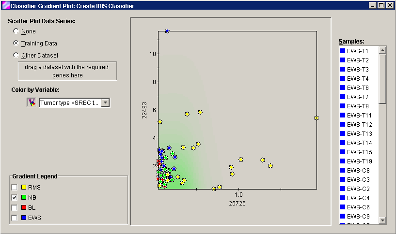
To display the Color Manager, double-click in the Gradient Legend box on the dialog, or select Color Manager from the Tools menu. Use the Color Manager to customize the colors used for the plot points and the gradient legend. In the example above, the dominant colors in the background gradient have been turned off.
Samples
To the right of the plot is a list of the samples in the currently displayed dataset.
To highlight a point and its sample name, click on a sample in the Samples list or a point on the plot.
To highlight multiple points and their sample names, press and hold the <Ctrl> key and click on the sample names in the Samples list or on points on the plot.
To highlight a series of points and their sample names, press and hold the <Shift> key and click on the first and last sample names in the Samples list.
Interpretation
This plot could be useful in creating general cause and effect rules. For example, you might be able to tell that there is a correlation between gene expression levels and variable class.
Related Topics:
Classification Plot - Classification Results