Protein Biomarker Discovery with GeneLinker Platinum
Introduction
Protein biomarker discovery is an area of considerable current interest in biology and medicine. Unlike genomic measurements, which generally require biopsy, serum proteins are highly accessible. This makes the use of protein biomarkers for cancer, for example, an attractive target for early diagnosis.
The protein biomarker dataset used in this whitepaper is the NIH/NCI Center for Cancer Research Ovarian dataset 8-7-02, which is available for download from the Clinical Proteomics Program Databank Website.
This paper discusses the use of GeneLinkerTM Platinum as an exploratory tool for the analysis of spectral data, and shows some results from GeneLinker’s supervised learning features, which can be used to classify the data into cancers and normals with 100% accuracy using only robustly identified features and in a very short time (the entire analysis described in this paper took less than a day.)
Emphasis is placed on the visual exploration of the dataset, so that only features that are robust and unlikely to be due to noise or other biases are used for classification.
Analysis
Spectral Data
Discriminatory features in spectra should in general depend on peak area, because peak area is an objective measure of the quantity of matter that the peak represents.
In the absence of a robust peak detector, which is currently under development, we use peak height as a stand-in for peak area in the Ovarian dataset 8-7-02, which appears to have a scaled binning that accounts for the constant resolution of the TOF mass spec.
In the absence of peak area estimation it is particularly important to use an exploratory tool such as GeneLinker to analyze data. It is easy for automated feature detectors to pick out spectral channels on the shoulders of peaks, where tiny shifts in calibration or resolution or noise can make a large difference to the measured channel value. As will be seen, this effect is apparent in a number of the highest-significance features found in a statistical analysis of the data.
Data Overview
The data consist of 253 spectra : 91 normals and 162 cancers.
The spectra have m/z ranges of roughly 0 to 20000 daltons and have 15155 channels, making rebinning unnecessary.
Unlike some previous datasets from the same source, these data do not have any systematic shift in overall spectral area between cancers and normals, and so no renormalization was done.
Prior to analysis the data were split randomly into training and test sets with 171 samples in the training set (61 Normal/110 Cancer) 82 samples in the test set (30 Normal/52 Cancer).
Statistical Tests
There has been considerable debate in the literature as to the virtues of peak finding versus channel-by-channel analysis. The advantages and disadvantages are as follows:
| Peak Finding | Raw Channels |
| Advantages | Disadvantages | Advantages | Disadvantages
|
| Peak area is the only proper measure of the quantity of matter at a given m/z value | Peak detection and area measurement are hard problems, and a poorly done job may distort the results | No risk of distortions from poor peak finding algorithm Channels values are highly correlated, making statistical analysis difficult. | More importantly, they are not an objective (instrument independent) of any feature of reality—they are accidental artifacts of the specific instrument and settings used, with no possibility of standard calibration.
|
At Improved Outcomes Software we are developing improved peak detection algorithms for application to mass spec data. We have investigated a variety of existing algorithms and found them less than entirely satisfactory for these data. We continue to believe, however, that peak detection and area estimation are the best way to handle spectral data. In the absence of satisfactory peak detection and area estimation algorithms, however, we have analyzed the raw channel data. This analysis highlights the flexibility and power of GeneLinker in performing an analysis on data that are quite different from those it was originally designed for.
The fundamental question for these data is: Which channels, if any, allow the most effective discrimination between Cancers and Normals? GeneLinker contains various statistical tests to help answer this question.
Looking at the summary statistics for the data, it is easy to see that they are not even approximately log-normal. This is another reason why peak data are superior to channel data: they are better behaved statistically. However, GeneLinker provides the Kruskal-Wallis algorithm, a rank-based test, for identifying channels that are significantly different between classes even when the data are not normally distributed.
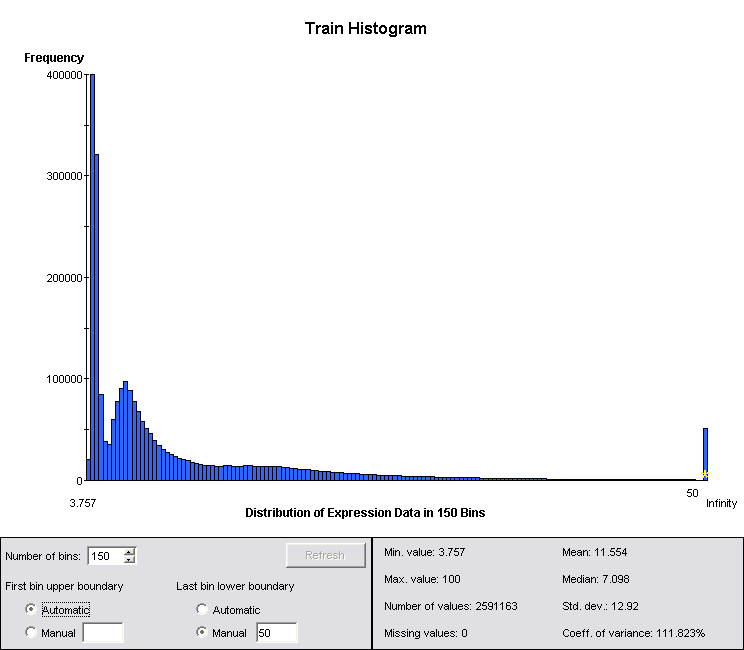
Figure 1: Summary Statistics for Log-Normalized Channel Data
Even in the case where the data are not log-normal, taking logs reduces the dynamic range and balances the significance of changes in regions of very different amplitude, particularly given the belief that less abundant proteins are likely to have a significant diagnostic role. The data were therefore log2 normalized prior to running the Kruskal-Wallis test, and all subsequent analysis was run on the log normalized data.
Because the data are highly correlated, there are many adjacent channels that have very low p-values. A simple means of visualizing the resulting “p-value spectrum” makes it easy to select the peaks that are most distinct between the two classes. Exporting the p-value results from GeneLinker, and then re-importing them using the “Import P-Value Spectrum” script creates a dataset from the p-values and false-discovery rate. Because of the high level of redundancy in the data, Bonferroni-corrected p-values are not included.
Log-normalizing the p-value spectrum and visualizing using a color-matrix plot makes it easy to pick the parts of the spectra that are most distinct. A fragment of the p-value spectrum is shown in Figure 2.
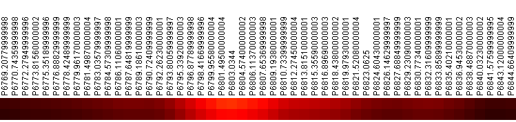
Figure 2: p-Value Spectrum Near 6800. Top row is p-value, bottom row is FDR. Colored by inverse heat (black = 1, white = 0)
There are three principles of spectral data analysis:
- Significant features must be consistent with instrument resolution
- Results must be independent of bin width to first order
- Significant features must be on the top of peaks, not on the wings
The last principle is particularly significant for these data, as a number of peaks show highly significant differences in the wings. These differences may be due to changes in detector resolution, increased noise in the electronics or shifts in calibration. They may also be due to changes in protein abundances, but this is far less likely than the instrumental explanations. For this reason, a review of significant channels was undertaken to ensure that they in fact identified peaks, rather than wings. Four out of 38 candidate peaks were eliminated based on this criterion.
Using the technique of visualizing the p-value spectrum with a color-matrix plot, it is possible to scan the resulting p-value spectrum by eye for significant channels, which takes a matter of minutes. A list of 38 significant channels was created in this way, which was reduced to 34 based on the principles laid out above.
This significance-based peak-detection is a unique innovation that illustrates just one of the many novel ways that Improved Outcomes’ GeneLinker can extend the boundaries of conventional analysis, and it will be a powerful tool in the future analysis of proteomics data. The significance of any peak ought not to be inferred based on the spectrum it is found in, but on the power it has in the classification task of interest. Some peaks that are very significant (ie large) in individual spectra have almost no discriminatory power. This technique has the power to focus in on only those peaks that are useful in classification.
Supervised Learning Results
GeneLinker includes committees of artificial neural networks (ANNs), committees of support vector machines (SVMs) and an Integrated Bayesian Inference System (IBIS). In practice, we have found SVMs to be superior classifiers on all types of biological data. Individual SVMs lack the flexibility of ANNs, which means they are much less subject to over-training. The unique GeneLinker committee architecture, in which we typically train 10 SVMs on different but overlapping subsets of the data, allows for robust generalization and clear identification of unknowns in test data.
Training a committee of 10 SVMs with cubic polynomial kernels on the 34 selected channels resulted in perfect accuracy on the training data (171 samples, 61 Normal/110 Cancer). Linear and 2nd order polynomial kernels resulted in less than perfect performance. In general, perfect performance should be expected on training data before it is worth running a classifier on test data.
The trained committee of SVMs also performed perfectly on the test data (82 samples, 30 Normal/52 Cancer). It is worth noting that prior to the removal of the four questionable channels, it was not possible achieve a perfect result on the test data. This suggests that the between-class differences in these channels are in fact due to artifacts of data handling or instrumental effects rather than underlying biological differences, which one would expect to be present equally in the test and training data.
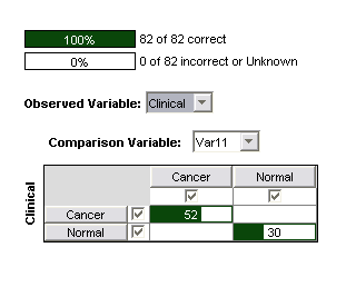
Figure 3: Confusion matrix for 3nd order polynomial SVM on 22 significant channels
Another advantage of SVMs is good performance with a large number of inputs—ANNs are not practical on more than tens of inputs. They can be trained, but tend to find very poor minima in the extremely large parameter space they find themselves in.
Refinement using PCA
To find smaller sets of peaks several techniques were used. One that has been very successful in our analysis of similar data is the use of dominant principle components. Principle Component Analysis (PCA) finds linear combinations of peaks that explain the most variance in the data. When applied to peaks that have been selected for their ability to discriminate between two or more classes, PCA finds linear combinations that give the largest variance between classes. By looking at dominant peaks in the first few principle components (the ones that explain the most variance) it is possible to find the peaks that have the most discriminatory power. These are not necessarily the peaks that have the lowest p-values, because several peaks in combination may have more discriminatory power than the individual peaks alone, due to the underlying gene regulatory network that couples the values.
GeneLinker provides an easy way to select the dominant PCA components by displaying the PCA loadings as a color-matrix plot and sorting by absolute value (this is the default sorting). Various heuristics can be used to set a cut-off on acceptable channels. In this case, all channels with PCA loading absolute values of more than 0.2 in the first five principle components were selected, yielding 22 channels that gave perfect accuracy for both training and test data with a committee of 3rd order SVMs.
These channels are included in the appendix.
Because of concerns in the literature regarding very low molecular weight values, as well as experience with spectrometer response in this region, all of our selected channels had m/Z > 2000. This restriction clearly does not impair our ability find excellent classifiers using relatively conventional statistical techniques.
Conclusions
GeneLinker is a powerful exploratory tool. It is highly optimized to allow users to bring the full power of their own intelligence as well as machine intelligence to bear on a problem. In the case at hand, this proved to be particularly important in eliminating some problematic channels that would have been selected by a purely automated algorithm.
Several of the channels found in our analysis are similar to those found by the originators of the data. In particular, Table 1 (in the Appendix) shows the peaks (channels) from their top seven models, in comparison with the peaks from our top model. The most common peaks from the previous work are also identified here, as well as several novel peaks that may be of further interest.
This study has introduced a new means of detecting statistically significant peaks in spectral data using visualization of a p-value spectrum
Using the techniques described here it was easy to find classifiers that produced 100% accuracy on these data. Note that feature selection was done using ordinary statistical tests rather than combinatorial tests. For data such as these, where at least some significant features appear to be artifacts, only the most robust feature identification will do.
Finally, a more complete analysis would include randomization trials, in which the sample classifications were permuted randomly. The significance of non-linear classifiers is very hard to estimate theoretically. Therefore, it is a necessary part of any full analysis to repeat the workflow with permuted class assignments to see if similar classification quality can be found.
Appendix A
Table 1: Original top peaks compared to top peaks from this work (bold values appear in more than one model, italicized values are probably not independent)
| Original | This Work
|
| 2690.84 | 2665
|
| 3534
|
| 3772.69 |
|
| 3798.43 | 3823
|
| 3915.65 | 3924
|
| 3974.02 | 3991
|
| 4144.45 | 4185
|
| 4413.01 | 4438
|
| 4746
|
| 4861.46 | 4821, 4908
|
| 5038
|
| 5243.15 | 5269
|
| 5454.9 |
|
| 6599
|
| 6803
|
| 7060.12 |
|
| 7062.95 | 7067
|
| 7333.51 |
|
| 7354.07 | 7376
|
| 7553.78 |
|
| 7648.01 | 7625
|
| 7756
|
| 8349
|
| 8516.66 |
|
| 8523.48 |
|
| 8602.24 | 8603.41
|
| 8622.9 |
|
| 8688.67 |
|
| 8706.07 |
|
| 8709.55 |
|
| 8949
|
| 9244.3 |
|
| 9480.17 |
|
| 9502.95 |
|
| 9510.55 |
|
| 9910.49 |
|
| 10054.21 |
|
| 10074.33 |
|
| 10513
|
Appendix B
Workflow Summary
- Import data
- Create/import clinical variable
- Log2 normalize
- Split test/train using variable created for the purpose
- Use Kruskal-Wallis test (or F-test for normal data) to identify significant channels
- Export p-value data
- Re-import p-value data using “Import P-Value Spectrum” script
- Visualize p-value spectrum using color-matrix plot and select significant channels
- Create gene list from selection
- Check that significant channels are on top of peaks, not on the wings
- Remove bad channels from gene list by visualizing p-values with color matrix plot, selecting gene list created in step 9, and Ctrl-click to de-select bad channels
- Filter training data on gene list and train committee of SVMs
- Test committee of SVMs on test data
- If results are satisfactory, run PCA (genes) on the filtered training data and select dominant channels in the first few principle components.