|

Platinum
Tutorial 9: Step 6 Display a Classification Plot
Display a Classification Plot
class="list-number">You can skip steps 1 and 2 if automatic visualizations are turned on as the Classification Plot should have been opened after the Classify experiment was completed.1. If the Predictions item (or whatever you named it) in the Experiments navigator is not already highlighted, click it.
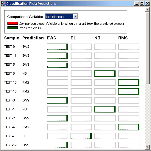
2. Select Classification Plot from the Predict menu, or right-click the item and select Classification Plot from the shortcut menu. The Classification Plot is displayed showing the predicted classes, the raw votes of the component classifiers and other information.
3. From the Comparison Variable drop-down list box in the upper right corner, select test classes. Red rectangles in the view signify misclassifications.
Interpretation
This is a very rich display, and it may take some experience before you are able to interpret it easily.
Each row represents a sample. On the left of each row is a Sample name and Prediction or predicted class. The rest of the display consists of boxes representing the outputs of the support vector machines for each of the possible classes for that sample.
Each column represents a class. The colors of the boxes are significant:
A box highlighted in dark green is the predicted class for that sample.
A box highlighted in red is the true class of that sample if one is known. (See the discussion in Step 10 about observations of ‘Unknown’.) The class of a sample that has a dark green box and a red box has been predicted incorrectly. If the classifier predicts the sample class correctly, or if the correct value is not known, only a dark green box appears.
A box that is colored gray represents neither the predicted class nor the true class.
If GeneLinker™ refuses to make a prediction for a sample, it will have 'Unknown' listed under prediction and no dark green box.
If the sample's true class is 'Unknown', it will not have a red box. (This will not happen when viewing training data since true classes must be known for all training samples.)
Hence the number of red boxes in the display indicates the number of misclassifications. Reducing the rate of misclassifications is discussed below.
Component Classifier Votes
Inside each box is a representation of the votes of each of the SVMs in the committee. Each of 10 SVMs was trained on a different 90% of the training data. Each of the horizontal rectangles in the view above represents the output of all 10 SVMs for a given class on a given sample. If all 10 SVMs are in agreement (i.e. have the same output value) then there will be a solid bar - at the right end if they all have high output (i.e. that is the sample's class), at the left end if they all have low output (i.e. that is not the sample's class).
Class Prediction Process
The class prediction (or call) is done by a simple vote. For a given sample, each SVM votes for the class with the highest output. If 2/3 (default setting) of the classifiers agree on a single class, we call that a prediction. In any other case, no prediction is made and the sample is labelled 'Unknown'.
Example:
In this case there are no red boxes because the classification accuracy was 100%. The 5 test samples of 'Unknown' type were classified but since we aren't sure that these calls are wrong, they are not highlighted in red.
Look at the outputs for Test-9. 9 out of 10 classifiers voted for EWS and the remaining classifier voted for RMS. Since this percentage (90%) was higher than the voting threshold (70%), the committee predicted that this sample was EWS (which was correct).
Reasons For Misclassifications:
There are often no misclassifications in the training data – SVMs are fairly powerful learners. If there are misclassifications, however, it may be for one of several possible reasons:
We may be using a set of genes which do not discriminate between the sample classes.
The training set may be unbalanced. That is, it may have too many examples of one class and not enough of another.
The data may contain errors such as mislabelled samples or incorrect measurements.
The voting threshold may be set too low.
The stopping criteria may have been set too loose (maximum iterations too small).
The above reasons may affect either training or test results. If the training results are excellent but the test results are poor, it may be for one of the following additional reasons:
The test data may be drawn from a significantly different population than the training data (such as the non-SRBCTs in the example above).
The test data may not have been normalized in a similar fashion to the training data.
The test dataset may have been filtered with different genes than the training dataset. (GeneLinker™ checks only that the number of genes used in training and prediction is the same, not their identities).
We may have set the number of hidden units in the neural networks too large.
We may have too many features (genes) for the number of samples in the training set.
The SVM parameters may not be appropriate (e.g. using the linear kernel may not allow good classification of a complex problem or using a polynomial kernel may not allow good classificatio of a simple problem.
These last three conditions correspond to a condition called ‘overtraining’. You can think of this as analogous to a child learning a certain set of examples by rote, but failing to be able to generalize from the examples to new cases. When a SVM is either given too much memory for detail (too complex of a kernel function), then it may simply ‘memorize’ the training data to the detriment of generalizing well on test data.